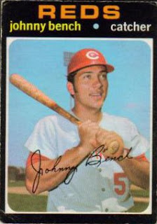
First, the obvious. Topps isn't liking the look of the O-Pee-Chee stuff. It's a little to deja vu.
Upper Deck's response: the 1970s Topps cards were posed. Theirs will feature action shots. Can we say smoke screen? I dunno, but I consider the design elements come from, well, the design, not so much the photo that sits around it. Don't get me wrong, the picture is key to any card, but color, fonts, borders, etc - those are the keys to design here. With that sort of argument Topps might as well counter and say that both cards are in English, therefore they're the same and Upper Deck should pay up.
I'm still under the belief that this suit's going to come down to the license Topps and O-Pee-Chee had. Did OPC own their borrowed designs or were they licensed. There's no doubt in my mind that Upper Deck is lifting Topps' designs. They're also lifting O-Pee-Chee's designs. But who do they ultimately belong to? And quite frankly, with a new O-Pee-Chee set on the horizon, I'm fine with letting the millionaires duke it out in court.
1971 O-Pee-Chee (Topps) Baseball
Notice the clear use of a posed photo.
2009 O-Pee-Chee (Upper Deck) Baseball Parallels
This card is soooo different. Forget the stylistic use of lower case letters, theblack borders holding a white frame, the upper case team name, that annoying dot. It's an action photo so it's not copying. End of story.
And in a 2-for-1 double post, here's the card of the day:
1971 Topps 5. Thurman Munson
I'm loving the crazy action shot. Dust in the air, immediate emotions on the face. I wonder if the unnamed Athletics player is safe or out. You couldn't pose something like this.


1 comment:
I would have though OPC licensed the designs, much like Rittenhouse licenses the, ah, Marvel license from Upper Deck. Did that makes sense? Anyway... I've been watching this for awhile and hoping UD gets slapped around for it. Why? Because companies need to stop heritaging designs! Give us something new, please.
Post a Comment