
As far as cards go, simple can be a great thing too. Done right, white space is aesthetically pleasing. Other than Topps' recent blank sketch cards they put in Topps Baseball, here's a card that has some of the most white space I can recall off hand:
 |
| Scooby-Doo: Mysteries and Monsters Case Card CL1 (Inkworks, 2003) |
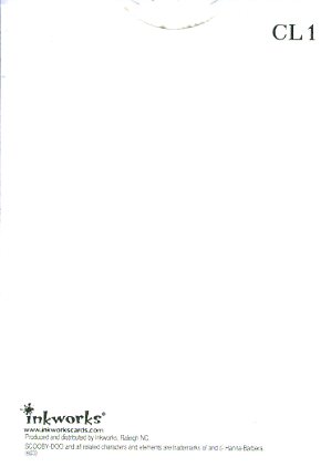 |
| Scooby-Doo: Mysteries and Monsters Case Card CL1 (Inkworks, 2003) (Back) |
The card comes from Inkworks' 2003 Scooby-Doo: Mysteries and Monsters. It was a case topper. I recently picked it up for a few dollars simply because it made me laugh. I grew up loving (and being scared of) Scooby-Doo and I love cards about cards. This self-referential masterpiece gets them both with hilarious results. Even the back takes the minimalist approach. Clearly, this is an instance where less is more and there's some complex thought behind its simplicity.

